
'Recognizing the need is the primary condition for design.'
Milton Glaser
Understanding Monograms
Microsoft Word document [21.0 KB]
Review the information below and complete all activities
A design composed of one or more letters, typically the initials of a name, used as an identifying mark.
Merriam-Webster defines a monogram as “a sign of identity usually formed of the
combined initials of a name.” This basic definition lends itself to the original purpose of a
monogram.
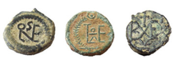
Early Greek and Roman rulers used their monograms on coins and other currency to
identify the ruler of the region from which it came.
The earliest known use of the monogram was on clay coins which were first made during the transition from a bartering system to a monetary system of trade. As time passed, it became common to mark the valuable property of nobility with a monogram.
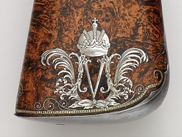 Monogram on stock of a firearm
Eventually, it became common to see an aristocrat’s monogram emblazoned on a variety of items from weaponry and armor to household items, royal banners and coats of arms.
In the Middle Ages, it became common for artisans to use their own monograms to sign their work. Museum curators today are even able to determine during which part of Rembrandt's career a particular
painting was completed simply by the monogram used to sign the piece. In his early years, Rembrandt used the simple monogram, RH. As his career progressed, he switched to the more formal, RHL.
Early monograms also consisted of only
two initials rather than the three to which we have more recently become accustomed. The three-initial monogram which is more common today did not gain popularity until the 18th century.
For many more examples of monograms please review the Met Museum Collection Here
Activity 1 - Discuss with a partner where you have seen Monograms before then answer the questions below
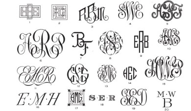 Monogram Examples
Question:
Sketch 3 versions of a monogram for the initials SIK, each version must develop from the previous version
6 points
Evaluate your best design with annoation using full senences.
4 points
(You will be marked on line technique, creativity and use of technical language).
Understanding Typestyles
Activity 2 - Review the information and presentation on this page and then answer the questions at the bottom of the page.
Definition of TYPESTYLE
First Known Use of TYPESTYLE
It is worth noting that with the introduction of Digital technology in the 1980's the meaning of the word Font has become popularly used in place of typestyle. A font is the "physical" realisation of a designed typeface, however, fonts used to be the metal stamps used in letterpress printing presses.
Categories of Typestyle or Font. Serif, Sans - Serif, and Script.
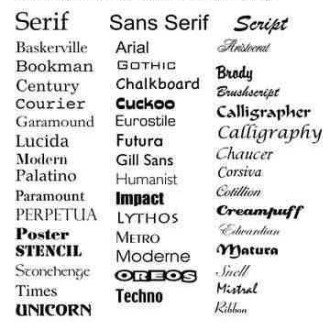
Serif fonts – Serif refers to the stylised ends and bars of the letters.
Reasons to use:
Serif fonts offer a more versatility than script fonts. They can be elegant or reserved, playful or professional,
Sans Serif fonts -Sans-Serif means without serif so you can recognise a Sans-serif front from its clean lines.
Reasons to use:
Sans Serif fonts are often a safe bet for logos. They are usually crisp, clean and offer straight even lines. Fonts like Helvetica, Impact, Gill Sans and Frutiger will generally reproduce well at all sizes. Sans Serif fonts can lend themselves to a wide array of uses ranging from industrial to high-fashion. They can be very bold and commanding, or very thin and elegant.
Script fonts-
Reasons to use:
Typically, script fonts are used to convey elegance or sophistication. They are often very detailed and attractive, and provide a sense of upper-class, femininity or charm.
Test your Typography identification skills with this font game
As well as identifing the font try to decide if each font is Serif, Sans-Serif or a Script
Questions:
List four categories of typestyles
4 points
Sketch an example of each typestyle
3 points
Explain why a designer may choose a san-serif style when designing a fashion product
3 points